Loud Week, Quiet Money
Everyone watched the headlines. The interesting part was happening somewhere else.

The headlines spent this week worried about Iran and the price of oil. Institutions spent it quietly buying the entire stock market.
Those are two very different activities, and the gap between them is basically the whole job here.
The tape never tells you what institutions are thinking. People are cagey about that, and anyway they often don’t know themselves. What the tape tells you is what they’re doing — where the actual dollars transacted. And the nice thing about dollars is that they don’t do press conferences. This week, once you got past the smoke, the money did three things worth describing in plain English.
First, the loud thing, so we can move on
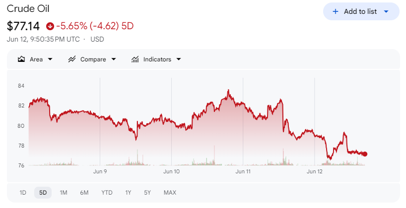
Stocks rallied because the US and Iran looked close to an interim peace deal. The Strait of Hormuz was set to reopen, oil fell more than 3% in a single day, consumer sentiment came in better than feared, and the odds of a Fed rate hike next week dropped to roughly 4% which basically means nobody thinks that’s happening.
Good news. Real news. Also news you already had, because it was on every screen in America. So I’m not going to pretend I’m adding much by repeating it. Here it is in a nutshell:
Now let’s go find the quiet stuff.
The shiny object: a company that didn’t exist on Thursday
We should talk about SpaceX, because it’s both important and a little ridiculous, and both of those are reasons to talk about it.
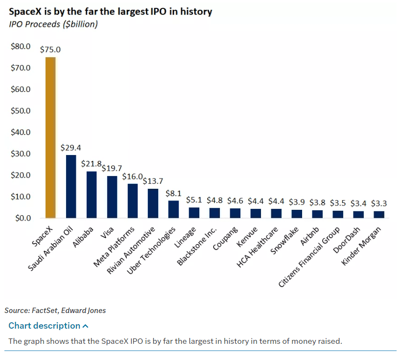
SpaceX went public Friday, closed up 19% from an IPO that was four times oversubscribed, and immediately became the single most frantically bought thing on our entire board — $1.59 billion in “sweeps,” which is the order type traders use when they’ve decided they’d like to own something right now, thank you, price be slightly damned. In our data it shows up with no sector label at all, just a blank space, because it’s so new the machinery hasn’t gotten around to filing it under anything yet.
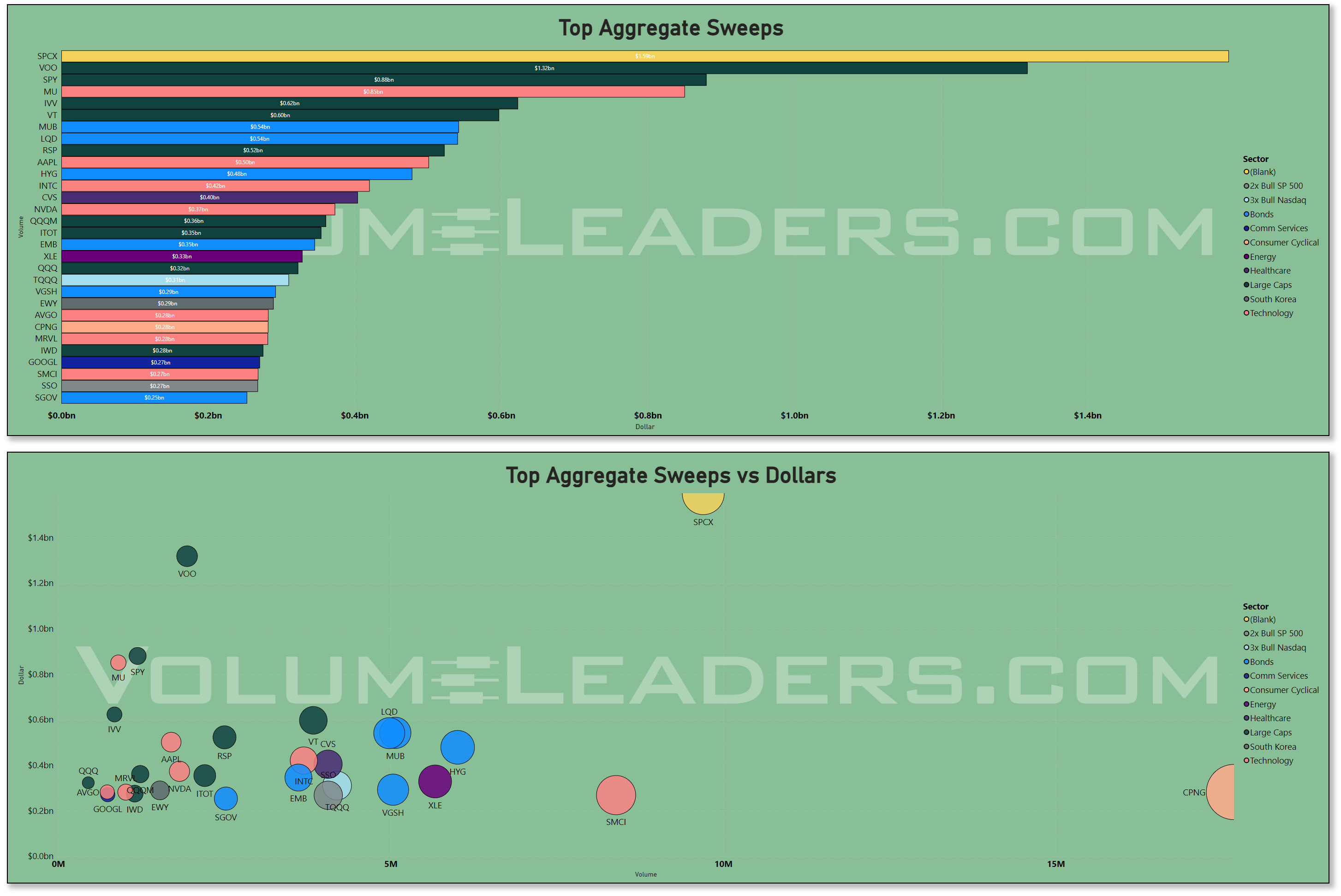
So here is the situation, stated plainly: the most aggressive buying of the week went into a stock that, the previous morning, you could not have purchased if you’d wanted to.
The part everyone will miss is that the other space stocks fell about 10% the same day. This wasn’t “investors love space.” This was “investors love SpaceX,” which is a much narrower and more interesting thing. When the appetite is that concentrated in the one name everyone’s heard of, it tells you something about how people are feeling — hungry, specific, a little starry-eyed — without telling you much at all about the market underneath. Note it. Don’t build a religion on it.
The quiet thing that actually matters
Here’s the part I’d circle if you only remember one.
The four biggest trades that crossed in the dark this week — the “dark pools,” which are exactly what they sound like and somehow also completely legal — weren’t stocks. They were the index funds. IVV, SPY, VOO, QQQ. Together: about $153billion of plain, unglamorous, buy-the-whole-market beta, moved quietly, off to the side where it wouldn’t push prices around.
To put $124 billion in perspective, that’s more than the entire annual economic output of a country like Kenya, changing hands in four names, in a week, in the dark, while the news talked about something else. The financial system is a genuinely strange place and I recommend never fully getting over it.
But strangeness aside, here’s what it means. When big money wants to be clever, it buys individual names. When big money just wants to be in the market — to own the whole thing and stop worrying — it buys the wrappers. And it does it in the dark when it would rather not announce the decision. So the simplest honest read is this: institutions used the relief rally to get long. Not to get cute. Just to get invested. That’s the most constructive thing in the whole week, and you couldn’t have seen it on a price chart if you’d stared at one all day.
Where we actually stand
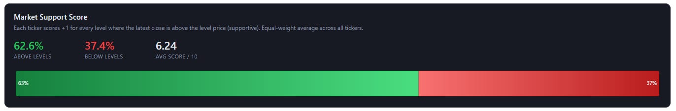
If you strip out the noise, about 63% of big and mid-sized companies are now trading above the prices where institutions have historically done their buying. Translation: firmly bid, not euphoric. Healthy. The kind of reading that’s optimistic without being the sort of thing that keeps you up at night.
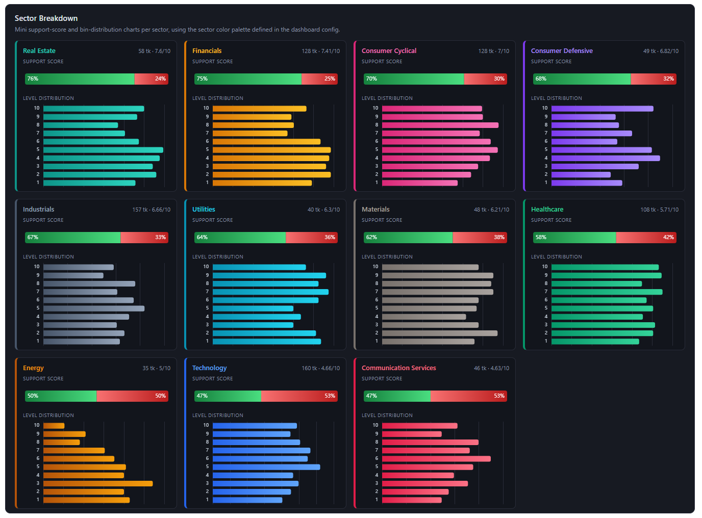
Okay, one chart. I know a box-and-whisker plot looks like something handed out in a chemistry final, but give me thirty seconds, because this is the most honest picture of the market I can put in front of you.
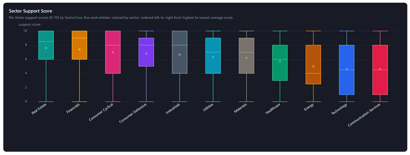
Here’s all it’s doing. Every sector gets one vertical box — read them one at a time. The dot is that sector’s average support score: how far above their institutional positioning the stocks are sitting, on a scale of 0 to 10. The box is where the broad middle of the pack lives, and the line through it is the run-of-the-mill name. The thin whiskers stretch down to the stragglers and up to the stars. So a tall box means the stocks in that sector wildly disagree with each other. A short box hugging the top means they’re all in good shape together.
The sectors are lined up left to right, best-supported to weakest, and the first thing your eye should catch is the slope. It runs downhill — from Real Estate, the banks, and the consumer cyclicals on the left, over to Technology and Communication Services way out on the right.
Which, when you think about it, is exactly the market you’d expect in a week when oil fell and rate hikes came off the table. The boring, rate-sensitive, oil-sensitive stuff is standing tallest. The expensive growth names everyone usually obsesses over are bringing up the rear. Value is leading. Quietly, the way it tends to.
Now here’s the part a simple ranking would’ve hidden from you, and the reason I wanted you to see the whole boxes. Every sector — even the strong ones — has a whisker running all the way down to zero. There is no sector where everything works. Real Estate is leading, and Real Estate still owns some completely broken stocks. Tech is lagging, and Tech is still full of names quietly doing fine.
One more small thing, because it’s lovely once you see it: in the leading sectors, the dot sits a little below the middle line of the box. That’s not a glitch. It means most of the names are genuinely strong, and a small handful of broken ones are quietly dragging the average down. The typical real-estate stock is in better shape than its own sector average lets on. (Averages are like that. Forever being ruined by a few bad actors — in markets, and in life.)
So the plain-English version: this chart tells you the odds, not the answer. Being in a strong sector means you’ve got the wind at your back. It does not mean you can close your eyes and buy the whole group. The most useful thing on this entire page isn’t “own Real Estate” — it’s that the spread inside every sector is so wide that which names you own matters more than which sector you own. Pleasant as it would be if the world sorted itself into tidy green and red buckets, it stubbornly refuses to.
Where does all that leave us? Firmly bid, led by the right horses, with broken names hiding inside even the healthy groups. Optimistic, eyes open. Which is about the best you can ask the market to be.
Which is a quietly encouraging thing, because rallies led by companies with a real reason to rise tend to last longer than rallies led by vibes. Not a guarantee. Just a better starting point.
The puzzle I can’t solve for you (because nobody can yet)
And now the genuinely interesting contradiction, which I’ll give you straight because pretending to resolve it would be dishonest.
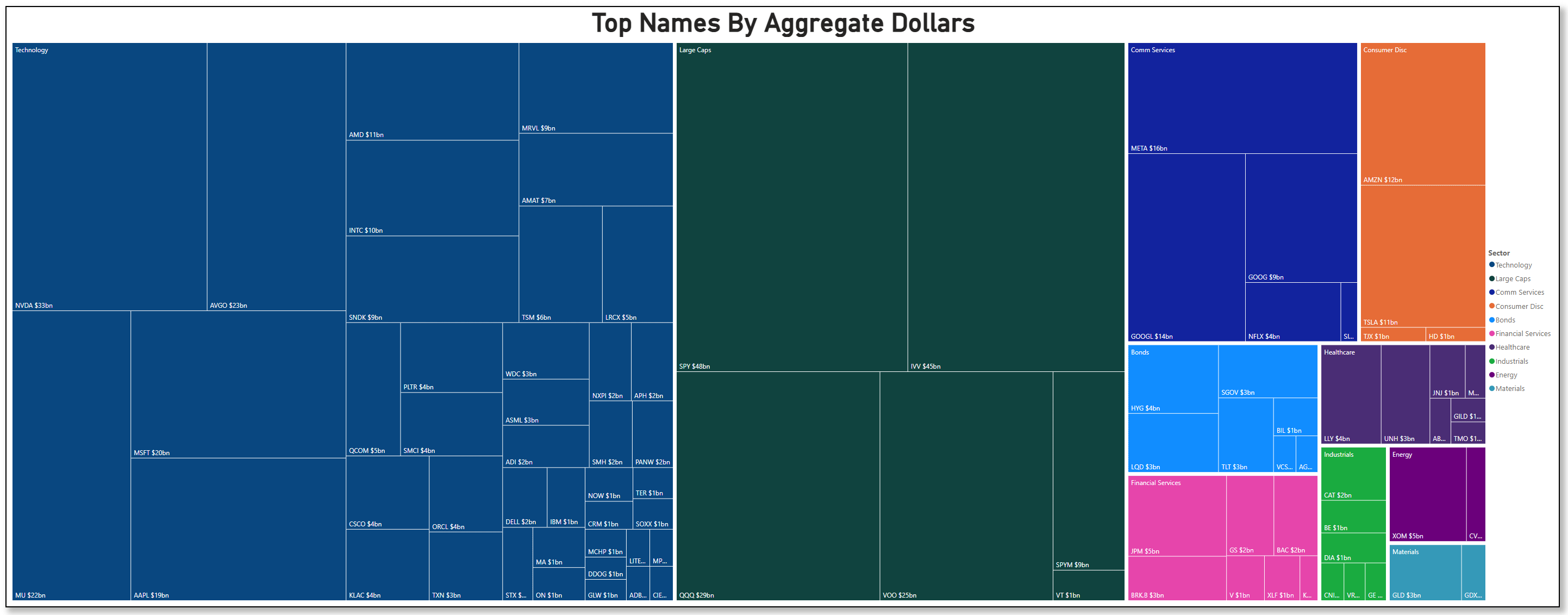
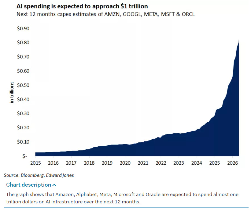
The most dollars this week poured into tech — NVDA, AVGO, MU, MSFT, the semiconductors especially, helped along by Oracle basically confirming the AI spending spree is still going strong.
You can see it in the flow rankings: the individual names commanding the most money are almost all chips and mega-cap tech, with NVDA sitting out on its own island.
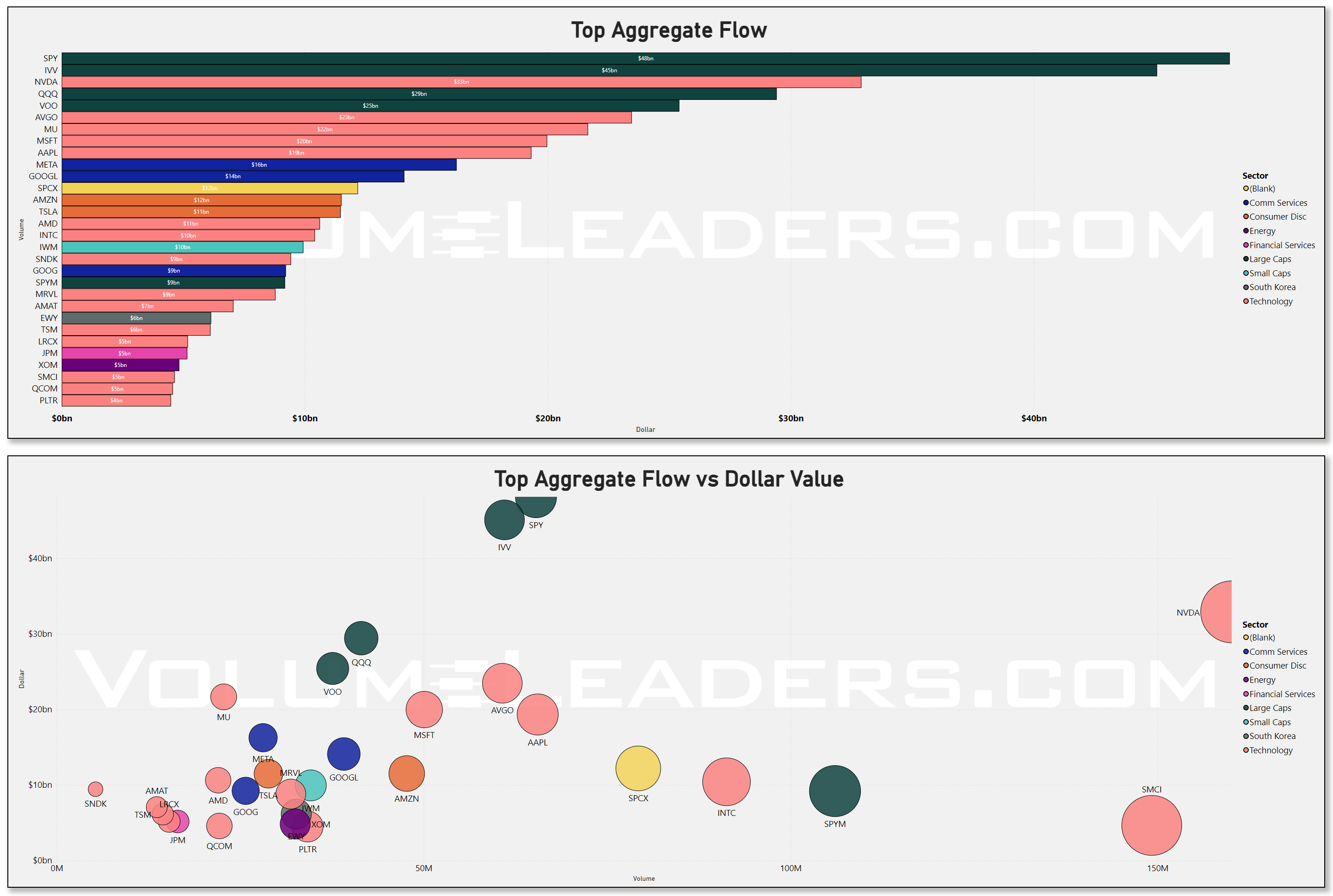
(That scatter underneath is worth ten seconds, by the way. It plots dollars against share volume, and NVDA is the dot way off to the right by itself — enormous money, enormous volume, completely alone. When a single name is that far from the pack, it’s usually because everyone, on every side of the trade, has decided it’s the thing to argue about this week.)
So far, so bullish. But here’s the catch: those same tech names are still trading below the prices where institutions have been the most active...On average, most of the recent institutional positioning is sitting above current closes. That clearly rings of distribution. And yet, the money is rushing into the stuff that hasn’t actually recovered yet. Which is either smart money buying the dip early, or smart money quietly handing off shares on the way out. Same data, opposite stories.
To figure out which, you have to stop looking at how much money went where, and start looking at where the prices sit inside each sector’s structure. That’s this next one — and it needs a quick word of introduction, because it looks busier than it is.
Each little card is one sector. The bar across the top is the simple version — what share of that sector’s stocks are trading above their institutional positioning (green) versus below (red). The stack of small bars beneath it is the part that earns its keep. Picture each stock’s price range as a ten-story building. Those bars show which floors the institutional levels are stacked on — floor 1 is the basement, the bottom of the range, suggests accumulation at the lows; floor 10 is the penthouse, suggests distribution at the highs. Long bar on a low floor means the heavy volume happened down near the bottom. Long bar up top means it happened near the highs.
Now, here’s the thing you can see only in this chart, and nowhere else on the page — the thing that turns “tech is weak” from a fact into a story.
Look at Technology and look at Energy. On the simple top bars, they’re near-twins: both weak, both sitting around 47–50% above their levels. If all you had was the support score, you’d shrug and lump them together as “the laggards.” But look at the floors, and they’re not twins at all — they’re opposites. Energy’s levels are stacked down low, on the bottom few floors, with price sitting just above them. That’s a sector that fell, built a base, and is starting to lift off the ground. Tech’s levels are stacked up on the middle and upper floors — and price is sitting below them. That’s a sector trading underneath its own crowd, with all that institutional buying hanging overhead on the floors above you.
Quick litmus test: let’s check the relative strength of SPY vs MAGS - the Roundhill Magnificent 7 ETF. Just go to Trading view and in the ticker box, instead of typing a simple symbol, let’s do a little math: SPY divided by MAGS or SPY/MAGS. If the resultant chart is going up, SPY is showing more relative strength than the darling tech names of our times; if it’s going down, SPY is underperforming these tech names:
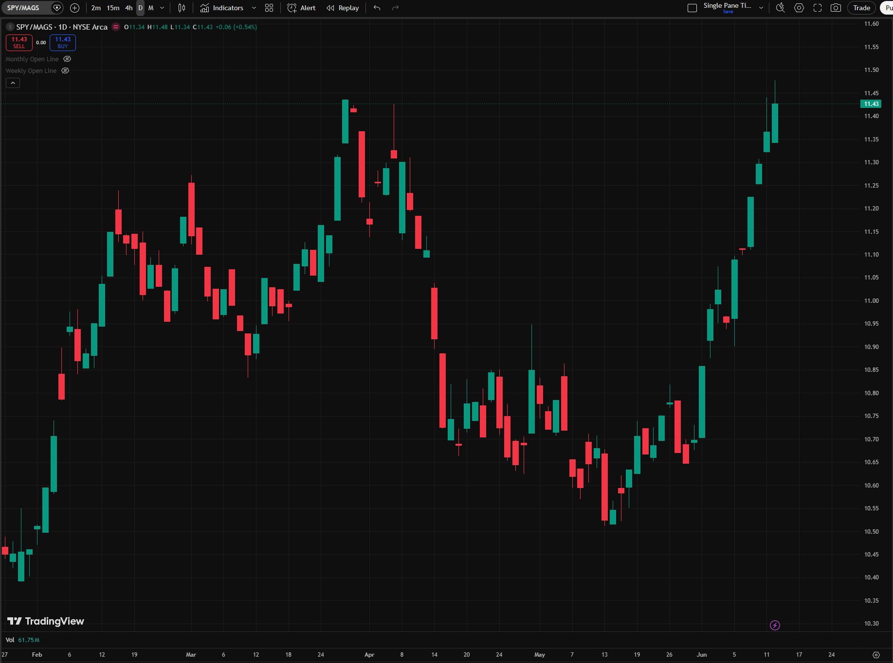
You have to ask yourself, SPY rallied hard out of the whole this week, what happened to the Mag7?
That’s the whole puzzle, in one picture. Energy’s weak score is constructive — price has lifted off its floor. Tech’s weak score is unresolved — price is pinned right beneath a ceiling of levels, with fresh money piling in underneath it. Two identical-looking numbers, two completely different situations, and you’d never know it from the headline.
So no, this chart doesn’t tell me whether the tech buying is accumulation or distribution. What it does is something better and more honest: it shows me why tech is the one I genuinely can’t call. It’s the only major sector where the money and the structure are in a standoff — dollars flooding in, price stuck just below the levels those dollars have to reclaim. Energy isn’t a puzzle; it’s quietly basing. Tech is the puzzle, and now you can see exactly where the argument is being had: on the floors just above today’s price.
Which gives us a clean thing to watch — and that’s where I’ll pick it up next.
What I’m watching
Do the tech names climb back above their levels, or not?
If the semis reclaim that ground over the next week, the dip-buyers were right, the rally broadens out, and this starts to look like the real thing. If the money keeps arriving but the prices stay stuck below those levels — that’s the tell that the quiet money was selling into the excitement, not buying into the dip, and now you can measure relative strength yourself vs SPY or any benchmark really.
I’m not going to guess which. The people who guess loudest about next week are, in my experience, the people you should trust least with money, including your own. So I’ll just watch the levels, watch whether that $124 billion of quiet index buying shows up again, and tell you which way it’s leaning as it leans.
The money this week said get long. I think it meant it. Whether it meant the whole market or only the half that’s already working — we’ll know soon.
One last map: where the quiet money actually lives
I’ll leave you with one of my favorite charts, and the one that needs the most introduction — so stay with me for a second, because once it clicks, you won’t un-see it.
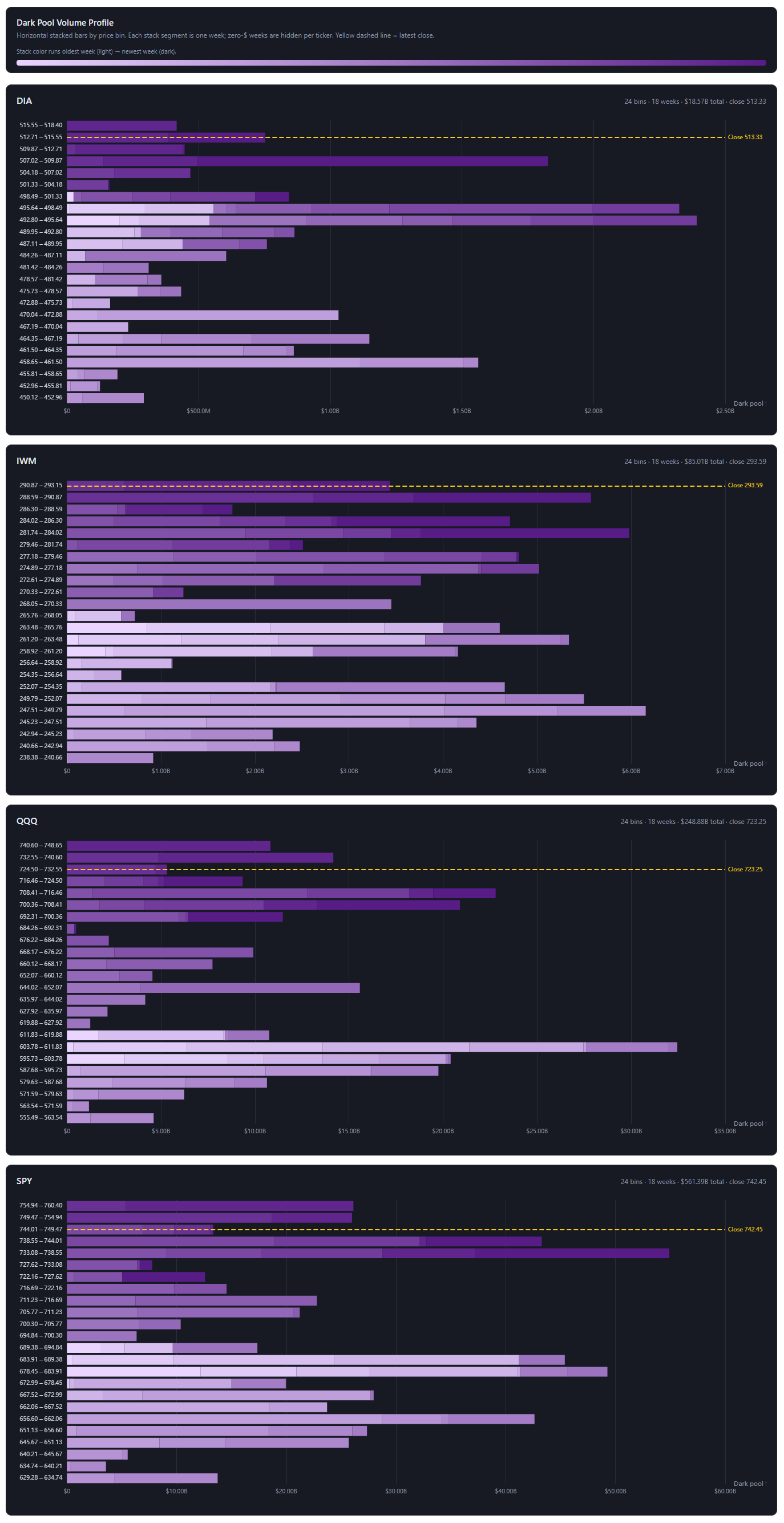
This is the map of where institutions are positioned based on dark pool data - data from exchanges retail traders don’t have access to. There is one each for the S&P (SPY), the Nasdaq (QQQ), the Dow (DIA), and small caps (IWM). And here’s the whole idea: instead of asking how much institutions bought this week, these ask at what prices they’ve been doing their off-exchange business — going back about eighteen weeks.
Three things to look at, and then the payoff.
The bars are shelves. Each row is a price band, stacked from low at the bottom to high at the top, and the length of the bar is how much dark-pool money changed hands at that price. A long bar is a shelf — a price where institutions did a lot of quiet business. Think of it as an archaeological dig down the price column: the wide layers are where the money is buried.
The yellow line is today. That dashed line is the current price. The single most important thing on each chart is simply this: is the price sitting above the big shelves, or below them? Above, and those shelves sit underneath like a floor, acting as support. Below, and they hang overhead acting like resistance, like a ceiling the price has to chew through.
The color is a clock. This is the part you won’t get from an ordinary volume chart, and it’s the whole reason these are worth your time. Each bar is shaded by when the business happened — pale for months ago, dark for just recently. So a shelf isn’t just a shelf. A pale shelf is an old fossil, money that got comfortable down there a long time ago. A dark shelf is fresh conviction — institutions building, right now, at that price. Same chart, two completely different meanings, and the color is how you tell them apart.
Now the payoff, because this week the four of them tell a genuinely tidy story.
On the S&P and the Nasdaq, the darkest, heaviest shelves are sitting right underneath today’s price. Not pale fossils from the spring — fresh, recent money, stacked up just below where the index trades now. In plain English: the floor isn’t old, and it isn’t far away. It’s being poured this minute, right under everyone’s feet and it has to hold if you want to be long-biased from here. That’s the same “institutions are quietly getting long” story from the top of the page, except now you can see it — the buying and the price are in the same place at the same time, which is about the most supportive thing a profile like this can show you.
Small caps are the interesting odd one out. There, the price has climbed clear up to the top of its whole eighteen-week dig, with most of its shelves — old and new — sitting well below. That’s not a problem, exactly; it’s what a strong run looks like. But it does mean small caps have gotten a little ahead of their own floor, with more air beneath them than the big indices have. Something to keep half an eye on if the mood sours.
That’s the map. The headlines will be different next week, as they always are. But the shelves move slowly, and now you know how to read them — which is more than most people staring at the same tape can say. Good luck out there this week. Wishing you clear opportunities, quiet conviction, and the discipline to watch what the money does instead of what the headlines say.